
Chris Appelgren created a lot of album art in his 20 plus years working for (and in the end owning) Lookout! Records. He was still in high school when he started at the label and worked with Green Day for the first time, contributing artwork for their first studio album, 39/Smooth. “For that album, I was only involved in the insert illustration, which I actually worked on during study hall” recalled Appelgren.

Along with album art, Appelgren was also tasked with making flyers to help promote Green Day’s availability for potential tour dates to those who purchased the album. “We sent it out with orders in case people who were ordering records wanted to help set up shows for the band.” Curiously, the ad also included the band members’ shoe sizes. “I think adding that was actually suggested by the band, probably Tre.”

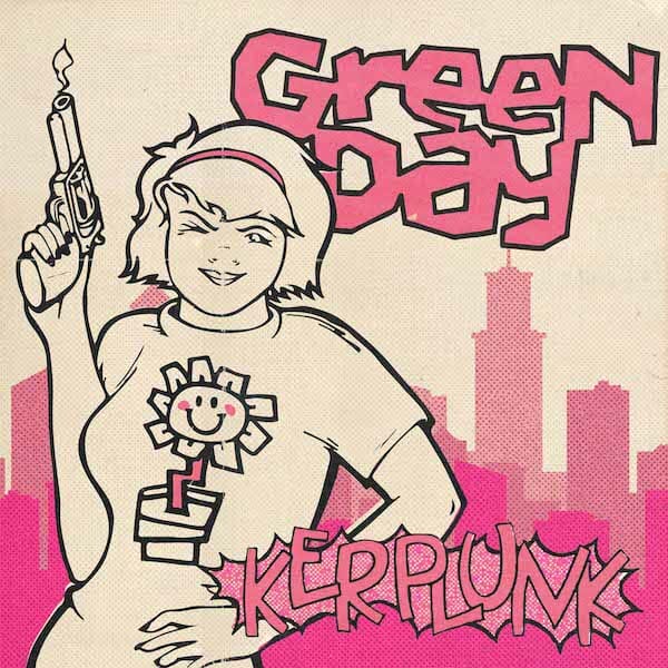
It can be argued that none of his art has stood the test of time better however than the album cover he created for Green Day’s second studio release – Kerplunk. Released in December of 1991, the album has gone on to sell over a million copies, receiving an RIAA platinum certification in 2003. “I recall reading an article with people being asked their favorite album cover artwork and Malcolm McLaren, manager of the Sex Pistols, citing Kerplunk as his.”
The story behind the Kerplunk cover
The cover is simple enough, plain even, but the girl holding a gun with a smiley-faced flower on her shirt has been recreated thousands of times by fans around the world in both artwork and tattoos in the 28 years since its release.

Most fans probably thought that the Laurie L story included on the album insert was inspired by the cover art but in fact, it was was the other way around. Lawrence Livermore, who is the founder of Lookout! Records and signed Green Day to the label, wrote the Laurie L story.
“(The cover art) was fully Larry’s concept. I don’t recall talking to the band about the idea as a concept without Larry, who’d already decided that his Laurie story was going to be included in the package.”
“It looks unfinished”
The idea for this story came about after reaching out to Appelgren for another matter and I mentioned how cool it must be to have the flower from the cover tattooed on fans all over the world. His response surprised me. “As far as feeling good about the art being popular, it’s awesome of course. I just wish the art itself was better. I wanted to add more to it (backgrounds, etc) but either Larry thought it seemed good as it was or we ran out of time before needing to deliver the complete art to the pressing plant.”

Asked what he would have changed if he had the chance, Appelgren quickly filled in the background of what we previously thought was a purposely sparse white canvas.
“I had ambitious ideas for the cover – hot pink background, city scene in the back, etc – but none of it came together. This is probably my most widely seen art and it’s ironic to me that it looks unfinished still — like it’s missing something. Of course, it wouldn’t make any sense to update it now, but it’s just kind of funny to me. I always wish I could go back in time and finish it. I am very happy with the flower, however. That came out perfect.”

A new take on the artwork
While it’s true it wouldn’t make sense for Appelgren to finish the artwork now after all these years, it doesn’t mean we can’t take his vision and see what it may have looked like if he had finished it. I gave three artists the new information from Appelgren and asked them to complete the cover with his original vision in mind.
So now, after all these years we can finally see something we didn’t know we were waiting for – what a finished Kerplunk album cover may have looked like.
Fan concepts
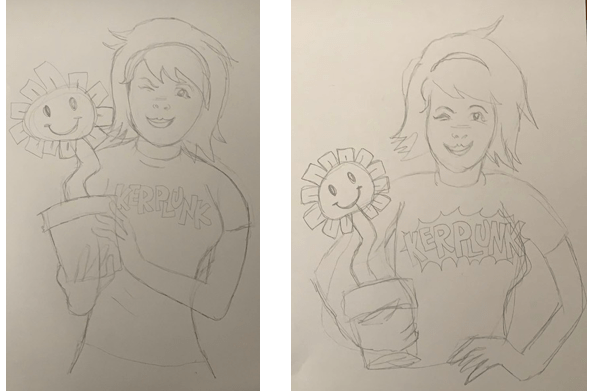
The first cover recreation comes courtesy of anonymouse from our Green Day Discord. He was asked to include the pink background with a city scene while given free rein to otherwise provide his spin on it.

Chris Appelgren: “Background on this one is very cool with the fisheye lens effect and the girl illustration effectively evokes the early 90s.”
Our second cover was created by JewishCupcake from the Green Day Discord. She was also given free rein and gave the Kerplunk girl a bit of a different look than what we are used to seeing.

Chris Appelgren: “While a little more haphazard, this is also great. I like the gun in the belt rather than being held and I also really like that it looks like Kerplunk girl is actually standing in a real place.”
Our final recreation comes courtesy of glenn_stefani from r/GreenDay on Reddit. He was asked to stick as close as possible to the original artwork while still incorporating the pink background and city scene.
Chris Appelgren: “This one is great and close to what I was imagining at the time. The use of a single color is era-appropriate as we were still doing all color separations with overlays (i.e. it was before Pat Hynes and I had access to scanners or used computers in our design efforts).”
Old vs new
Now that we’ve seen how it may have looked, I think Appelgren is correct that the original looks a bit unfinished in comparison. Let us know what you think in the comments below – do you like the new takes on the Kerplunk cover or do you prefer the classic version that was released?
Special thanks to Chris Appelgren for his contributions to this article and to the three talented artists – anonymouse, JewishCupCake & glenn_stefani – who submitted their artwork.